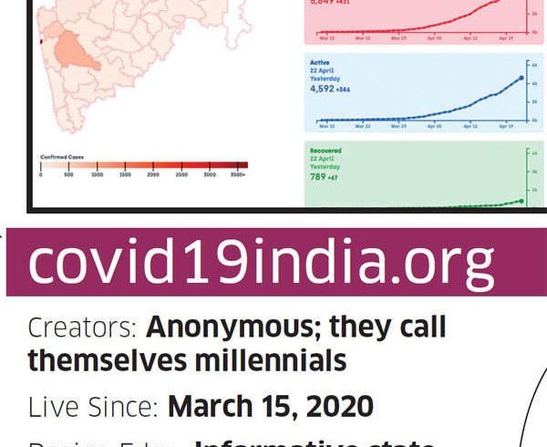
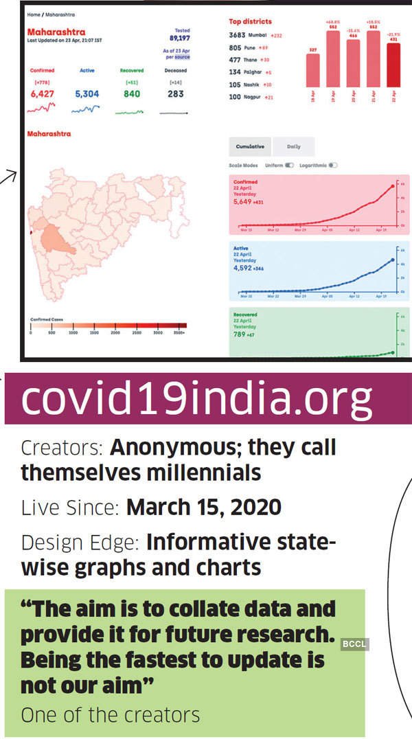
April 28, 2020. It’s 4 am in India. It’s been over an hour since the millennials running covid19india. org last updated their dashboard tracking the pandemic outbreak in the country. Many of the site’s 90,000-odd Twitter followers are frantically tagging it in their tweets.
Vijendra Rana sounds restless. “Uttarakhand update not good,†he tweets to @covid19indiaorg.
“The district-wise data (in Gujarat) is not updating. Only the active cases are increasing,†posts Kabir Khan.
“Please put up a column for doubling rate and five-daysmoving-average of active cases. The picture will be clearer. Won’t take too much to code,†suggests Diptendu Bhatacharya in his tweet.
It’s half past 4 now. The home page still says, “Last updated at 3:01 am.†Rana, Khan and Bhatacharya barely have 100 Twitter followers between them, but they mirror the sentiments of thousands in their anxiety and inquisitiveness in these Covid-19 days. Over the last six weeks, dashboards like covid19india. org, covindia.com and againstcovid19.com/india have become the first port of call for people looking for up-todate data on the outbreak in India.
Among those tracking global numbers, the likes of ourworldindata.org/coronavirus, covid19stats.live and ncov2019.live have gained traction with millions of users worldwide. From ordinary folk to policymakers, corporates to research firms and even government agencies, many are actively seeking authentic information on Covid-19’s impact on human lives — to stay updated and avoid misinformation-induced panic.
“They are the best source of data available right now since the government doesn’t give granular data in one place,†says Sid Rupani, 36, a Delhi-based supply chain consultant, who actively follows two dashboards for professional and personal reasons.
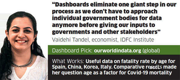
Without the dashboards, Vaidehi Tandel won’t be able to do half her work. Tandel is an economist with the Mumbai based think tank IDFC Institute. Her job requires processing data across several metrics in real-time, in order to give inputs to governments and other stakeholders. “Having access to these dashboards eliminates one giant step in our process as we don’t have to approach individual government bodies for data anymore,†says the 32-year-old Mumbaikar.
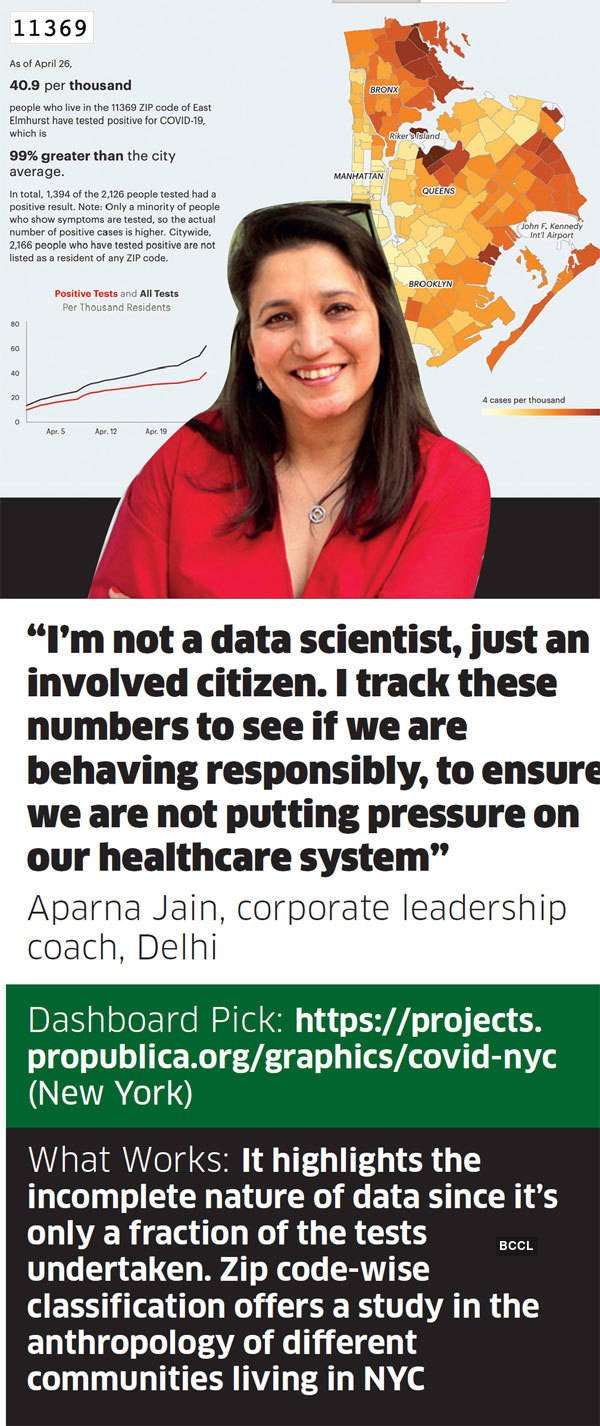
In Delhi, Aparna Jain follows dashboards to assess whether we are being responsible citizens and practising social distancing. She tracks the numbers to ensure that we are not putting pressure on our healthcare system. “I’m not a data scientist, just an involved citizen,†says the corporate leadership coach.
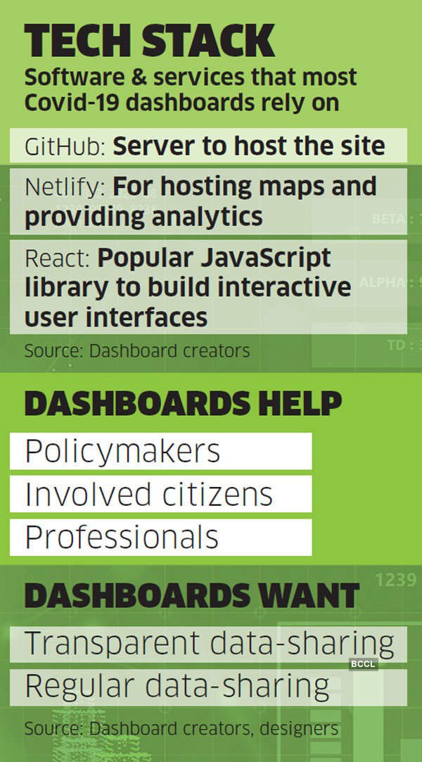
Created by self- or peer-motivated volunteers across different age-groups and disciplines, these dashboards collate data round the clock from different government agencies, health institutions and other reliable sources, and present them in simple, easy-to-understand infographics. Most dashboards are built as open-source platforms so that anyone can access their code to build one for their region.
Kerala-focused Covid19kerala.info, which went live on March 22, adapts the framework of a dashboard created by a few techies for Japan in February this year. Most of them rely on the same big names in the software industry — like GitHub and Netlify — to host their sites, maps, etc. Given the special nature of these projects, many tech companies offer their services pro bono, bringing the cost of running dashboards down to zero in most cases. The creators are also finding solutions to the same problem, more or less. Yet, every dashboard has a different origin story.
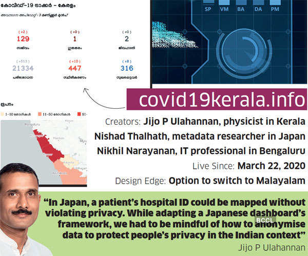
Covid19kerala.info, for instance, was cofounded by Jijo P Ulahannan, a physicist based in the state, along with Nishad Thalhath, a metadata researcher based in Japan. “During the 2018 floods in Kerala, Nishad told me that Japan keeps a metadata repository for every calamity. He encouraged me to document the flood’s impact so that future generations can be better prepared for a crisis like this,†recalls Ulahannan.
Coronavirus: Case fatality rates by age
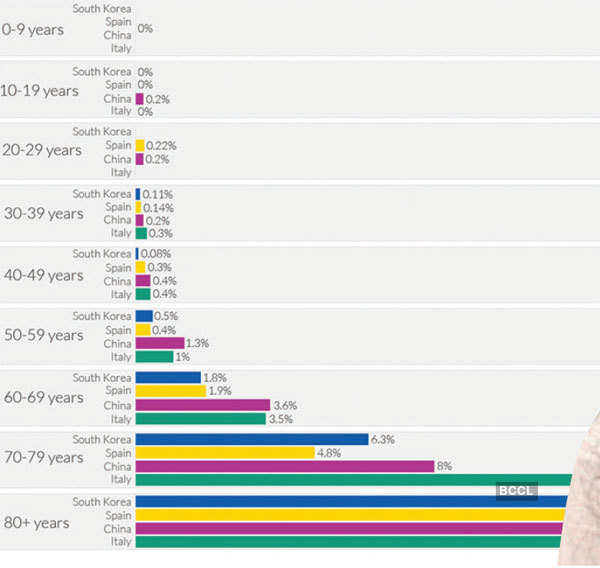
( Case fatality rate (CFR) is calculated by dividing the total number of confirmed deaths due to COVID-19 by the number of confirmed cases.
Two of the main limitations to keep in mind when interpreting the CFR:
1)many cases within the population are unconfirmed due to lack of testing
2)some indiviuals who are infected will eventually die from the disease, but are still alive at the time of recording)
Two years later, when Covid hit Kerala, Thalhath — already exposed to the Japan dashboard by then — referred it to Ulahannan to develop it further. Ulahannan took his words literally. Shane Reustle, an American software developer based in Tokyo, who built the Japan dashboard called covid19japan.com with a bunch of design and tech partners, tells ET Magazine: “The team in Kerala took our code, changed it to their needs and made it better. Then they pushed us to adapt those improvements as well.â€
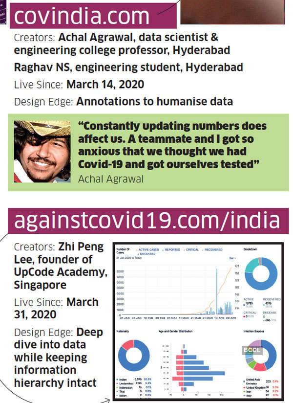
In the case of covindia.com, the founders — Achal Agrawal, who teaches at Mahindra Ecole Centrale college of engineering in Hyderabad, and his student Raghav NS — were planning to visualise data on India’s map for a hackathon scheduled in the first week of April. The hack they eventually devised was to visualise district-wise growth of the pandemic on India’s map. The site gets roughly 30,000 page views per day.
Now, these two dashboards are run by a team of about 20 people each. The millennials of covid19india.org, who refuse to share their identity, claim they have had help from at least 1,000 volunteers since going live in mid-March. In the vast tech universe, though, Covid dashboard creators are a tiny community. Even if they haven’t met each other, they know of each other. And they have a mutual admiration society of sorts.
Agrawal of covindia. com acknowledges the user interface of covidout.in. It was a popular dashboard, he notes, that abruptly shut down in late March. Rohan Daxini, founder of covidout.in, attributes the shutdown to domain provider and registrar issues. Instead of reviving the site on another server, Daxini chose to help others who had come up with their dashboards.
“It was not a competition. If others were doing great work, we must acknowledge and offer help,†says the founder of Mumbaibased software firm Kiprosh. Paying Agrawal’s gratitude forward, Daxini praises programmer Zhi Peng Lee’s dashboard for Singapore that initially inspired his layout.
On March 31, Lee, founder of UpCode Academy, created againstcovid19.com/india along the same lines as the Singapore one. While most other dashboards use dark backgrounds and lots of reds and greens for text, againstcovid19.com/india uses tints (light colours).
“It also does a deep dive into data while keeping the information hierarchy intact,†says Himanshu Khanna, founder of Delhi-based design consultancy Sparklin. It starts with the most essential piece of information — total cases, active cases, deceased and discharged. “As you scroll down, the information keeps getting more nuanced, flush with pie charts and bar graphs,†says Khanna.
There is something unique to the design philosophy of each of these dashboards. “Having an option to switch to Malayalam instead of assuming everyone can understand English is a plus for the Kerala dashboard, for instance,†says Rasagy Sharma, a Bengaluru-based designer, who specialises in information visualisation.
Covindia.com uses annotations to humanise data, like “Be safe†for the number of cases, “Be calm†for recovered patients and “Stay informed†for the number of deaths.
Delhi’s Jain has been following a ProPublica dashboard for New York City since her brother lives there. This one visualises data across the city’s 100-plus zip codes on a map. The dashboard highlights the uncertainty factor attached to all Covid data. “Only a minority of people who show symptoms are tested, so the actual number of positive cases is higher,†reads the text under every zip code’s Covid summary.
This tiny dashboard stands tall amid many that leave things open to interpretation. Explaining the meaning and implication of each aspect can help avert multiple narratives among readers, says Sharma.
Lee’s India dashboard does that to an extent, notes Sparklin’s Khanna, by adding percentage distributions next to all essential figures. It instantly shows that while 3-4% of total cases have resulted in deaths, over 25% have recovered. Another way to do it, says Sharma, is by showing cases per thousand of the population in a containment zone, as opposed to painting the whole town red on the map. This is about people dying, communities and industries suffering. Understanding the ethical responsibility of design is critical here, he adds.
Ulahannan, co-creator of the Kerala dashboard, agrees that there’s ample room for contextualisation of the Covid data. However, he points out that these are early days.
Data scientists and data acquisition managers are struggling with the unavailability of complete data, or its availability in an unstructured manner, on most days. There’s an ongoing debate on the use of red to determine containment zones, and on using a dark background for the site as a whole — although the covindia.com team makes the case for darker background being easier on the eyes. Adapting foreign frameworks isn’t a cakewalk either.
In Japan, a Covid-19 patient’s hospital ID can be mapped without violating their privacy, says Ulahannan. “We had to be mindful of how to anonymise data to protect people’s privacy in the Indian context,†he says.
Things haven’t been smooth-sailing for Reustle in Japan, too. “When we started, our biggest challenge was that the government was releasing data in Japanese, with no visual indications.†Before they could analyse the data, they had to translate it. Another problem facing many dashboards is the redaction of numbers. Reustle recalls an incident where certain people wrongly tested positive, “so they had to redact that data at onceâ€.
An even bigger challenge: as numbers go up, dashboards can cause panic than reduce it. At a life stage where everyone is likely surrounded by more numbers than living beings, it is easier to go down the dashboard rabbit hole.
“From a professional aspect, you may start seeing these numbers and trends with fascination,†says Rupani from Delhi. “Once you zoom out a little, you realise the actual human toll it is taking. It can be emotionally challenging,†he adds.
In the beginning, Rupani spent three hours browsing these dashboards. Now he checks them once a day, for a total of 30 minutes. Constantly updating these numbers affects the creators, too. At one point, the influx of cases got to Agrawal and Raj Narayanan, a designer in the team.
“It made us so anxious that we felt we had caught the virus. So we got ourselves tested,†says Agrawal. These days, the team tries to keep the mood light on their 20-plus Slack channels to better cope with disturbing moments.
“I hope no one else sees those chats though,†he adds. After the call, Agrawal shares a screenshot of one such chat in confidence. Truly, unlike the Covid-19 data, some things are better left undisclosed.
